Husaini Blood Bank

Enhancing brand identity for
Husaini

Services

Branding

Introduction

HOW IT BEGAN

Started in 1979, Husaini was formed with the aim to provide safe blood to our communities. The vision of Husaini has since grown to become a holistic healthcare services organization.

our role

Designist collaborated with Husaini to build out their brand identity across various assets.

Creating Identity

The Husaini symbol is a combination of many messages
within it’s design.
Abhi Finance

Firstly each petal is in the shape of a blood drop and spells Husaini in the Urdu and Arabic language. This represents what the brand stands for in delivering
safe blood.

Abhi Finance

Secondly the blood drop is rotated five times to
represent the “Panjatan” in the Muslim Shia belief
system. This rotation also takes the shape of a flower
which is a symbol of love, hope and compassion. Lastly the choice of red represents love, blood, and
health.

Husaini Blood Bank

Initial Sketch

Husaini Blood Bank

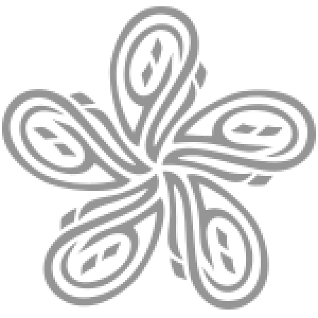
Sketch rotation to form a flower

Husaini Blood Bank

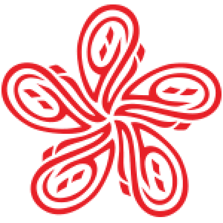
Colour palette introduced

Lasting Impressions

It was important that this brand identity was then
visualised across all assets of the organisation. From
stationary, to banners, to their digital platforms - the
identity of trust, health, and safety is echoed.
Husaini Blood Bank

Related Projects

Back