Building an Ecosytem for Home and Office Automation
Services
UI/UX Design, Product Strategy
Introduction
HOW IT BEGAN
MUX is a home and office automation product that utilises internet-of-things technology to bring ease to customers.
our role
Our role was to provide guidance on visual identity, product design, and the UI/UX of their digital interfaces. With Pakistan being a new market for home automation, it was essential for all pieces of the puzzle to fit in perfectly to ensure customer uptake.
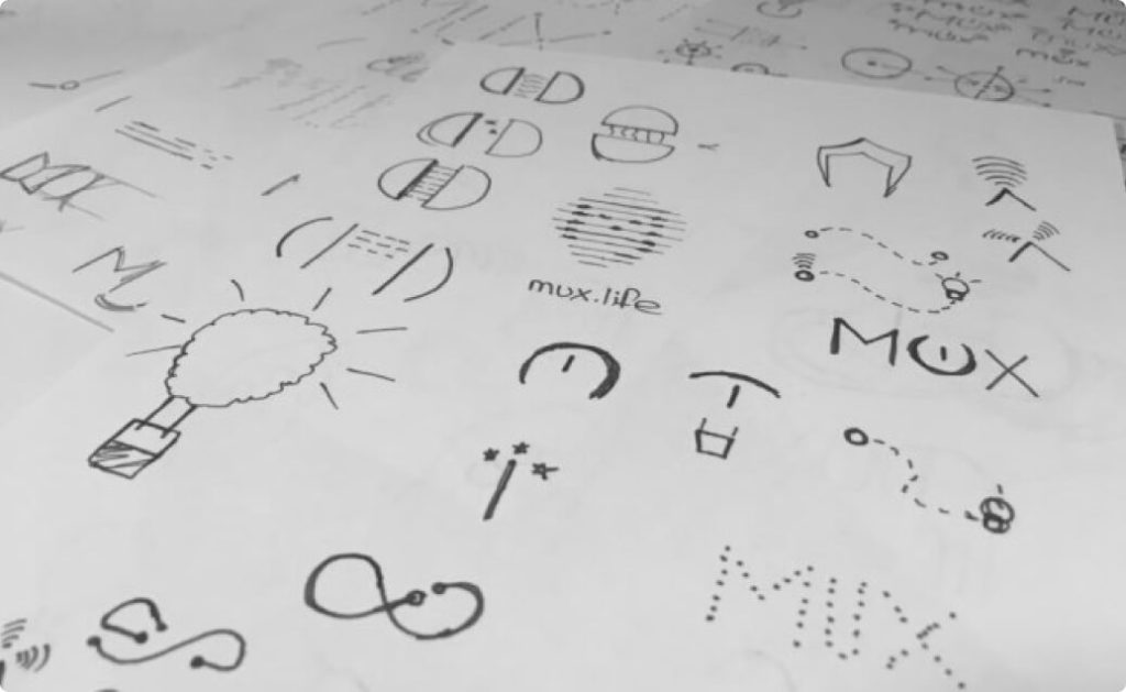
Brand Ideation
Our team ideated and iterated to ensure that the logo portrays the functionality of the brand, loud and clear. It incorporates associations of electric power and connectivity into the letters.
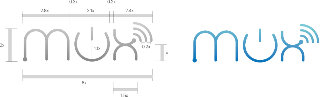
Logo Structure
The logo ideation results in a type-base that is able to visually reflect the overall functionality of the brand. The “m” signifies flow and flexibility, “u” is integrated with the power icon, and the “x” embodies connectivity with the wifi icon. Combined with the colour and font selection - we portray a young, vibrant, and innovative brand.
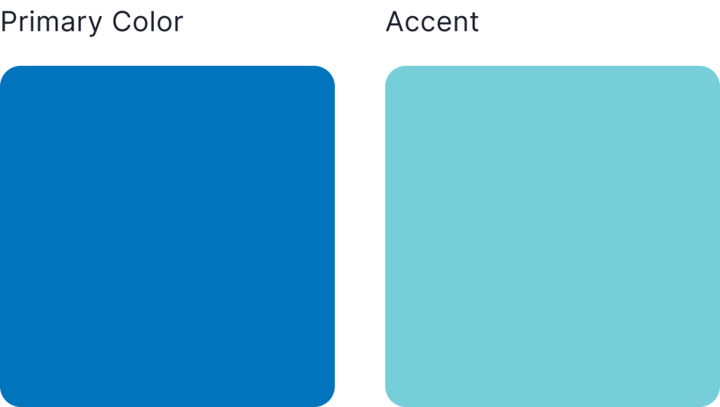
Brand Colour
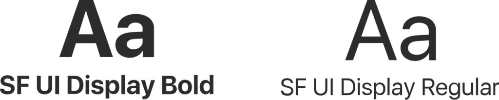
Brand Fonts
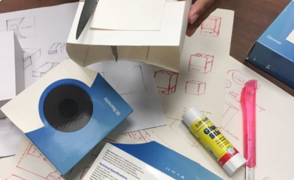
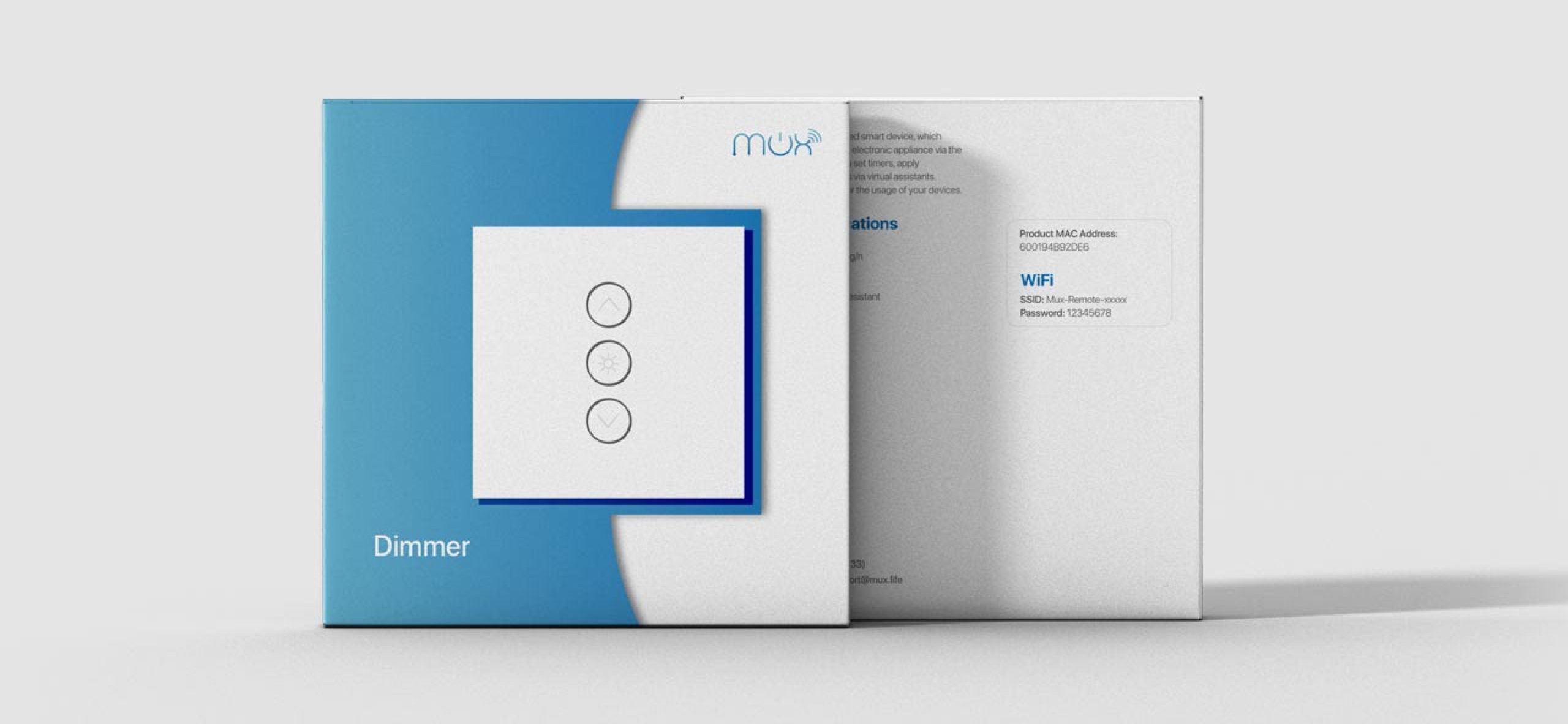
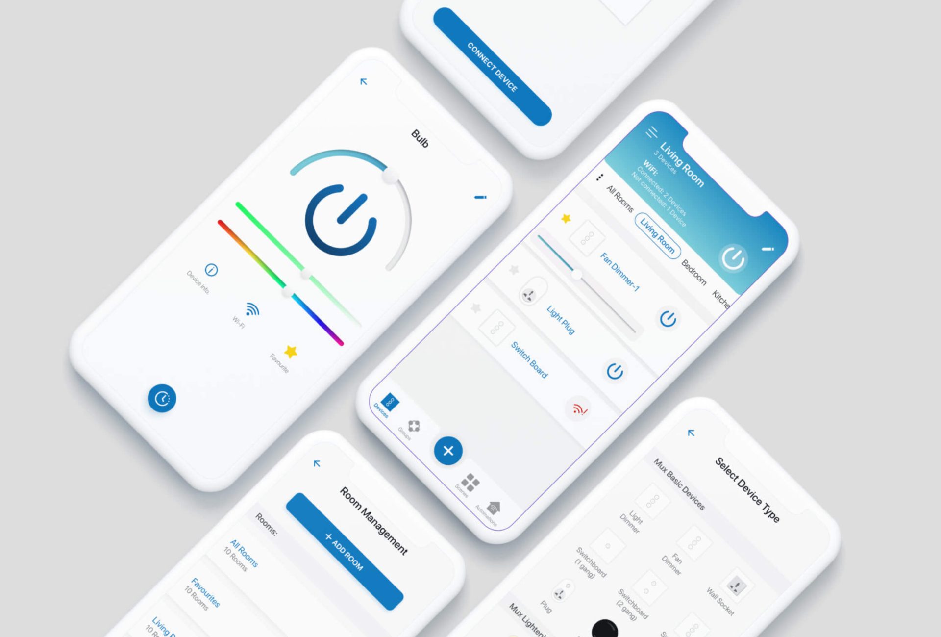
Package Design
In developing the product and its accompanying digital interfaces, our team had to ensure that the final product is aesthetically appealing and ergonomic. The switchboards, lighting panels have all been designed by our team to ensure ease of use. The same principles have been applied to the creation of the platform that user’s utilise to automate their homes and larger commercial buildings.
The Outcome
Mux has built a platform for home and office automation in Pakistan, with the team being one of the leading practioners in the space. In 2021, their expansion in the local market was amongst the highest in the industry. In 2022, they've expanded their solutions into both residential and commercial buildings at scale.