Taraki
Designing experience for employment and networking platform
Services
Branding, Product Strategy, UI / UX Design,
Industry
Early Stage Startup
Project Overview
Taraki is an employment platform designed to connect blue- and grey-collar workers with job opportunities, while also providing employers with a streamlined hiring experience.
Our Role
Taraki partnered with Designist to redesign and restructure its digital presence and brand ecosystem, ensuring a seamless experience for both job seekers and employers while strengthening its market identity.
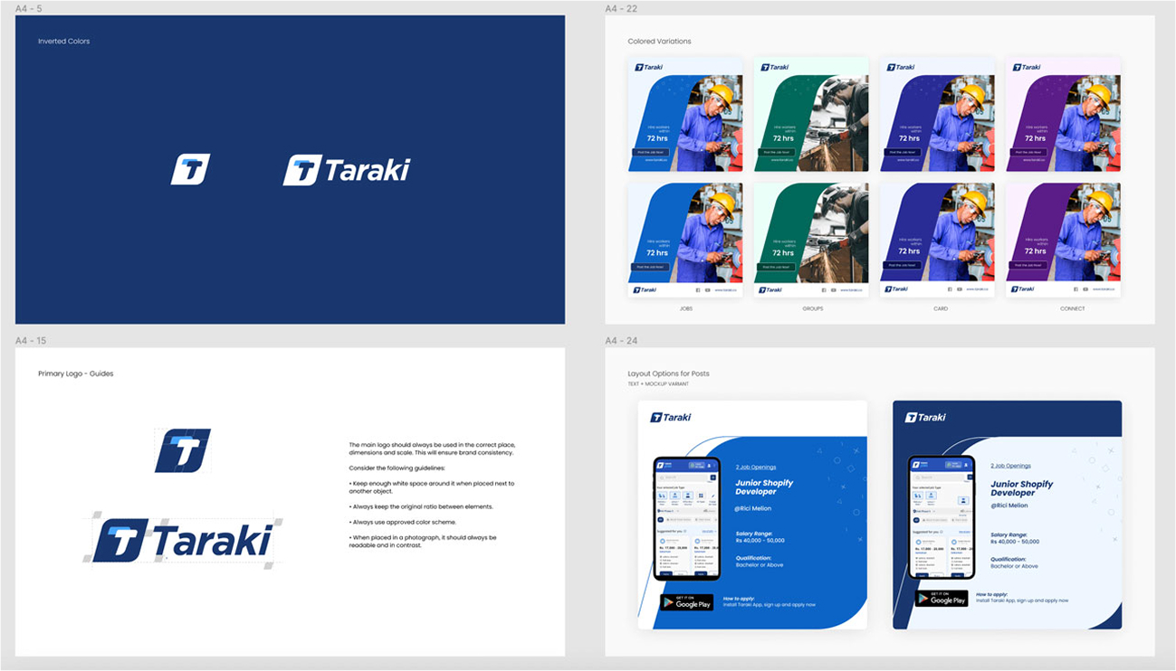
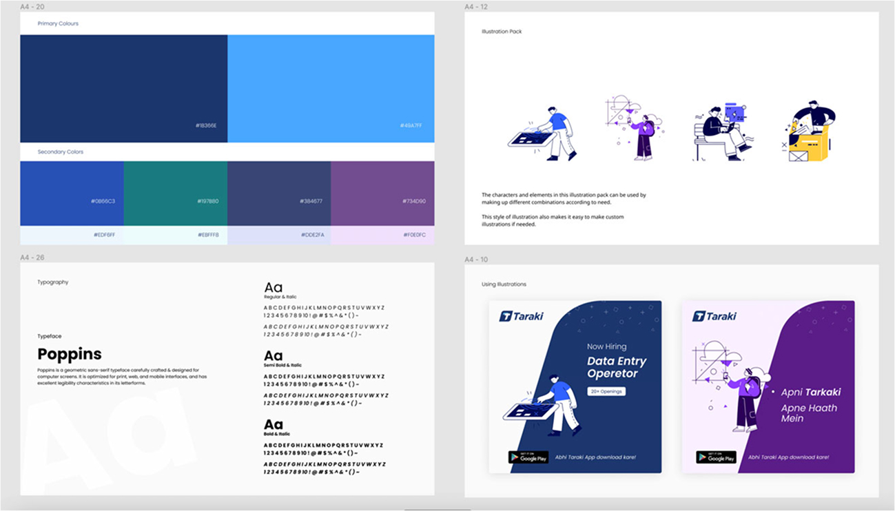
Creating a Strong Brand Ecosystem
We expanded Taraki’s visual identity beyond just the logo, establishing a cohesive design system with defined typography, color palettes, and UI components to ensure consistency across all platforms.
We also developed investor documents and marketing materials that aligned with Taraki’s vision, reinforcing brand credibility. To create a unified experience, brand messaging and tone of voice across all user touchpoints were also standardized, strengthening brand recognition and trust.
We also developed investor documents and marketing materials that aligned with Taraki’s vision, reinforcing brand credibility. To create a unified experience, brand messaging and tone of voice across all user touchpoints were also standardized, strengthening brand recognition and trust.
Redesigning the Job-Seeking Mobile App
We redesigned the job-seeking mobile app to create a seamless and user-friendly experience. The job search and application flow were simplified, making the process faster and more intuitive. Onboarding was revamped to clearly guide users through sign-up and profile creation, reducing drop-offs. Additionally, we introduced micro-interactions and real-time feedback, enhancing engagement and ensuring users stayed informed throughout their journey.
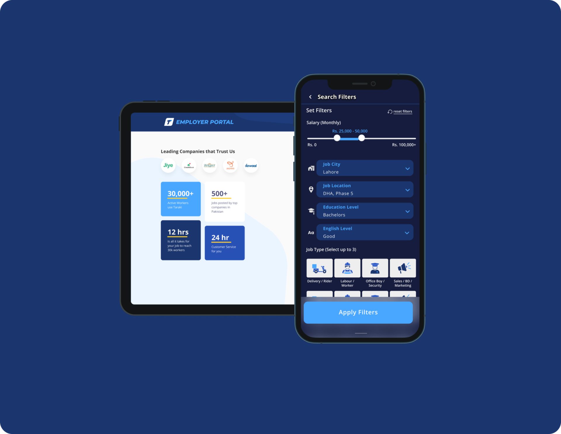
Enhancing the Employer Web Portal
We revamped the job posting interface to reduce friction and simplify candidate management, making it easier for employers to post jobs and review applications. An intuitive employer dashboard was designed to provide real-time analytics and application tracking, allowing for better decision-making. Additionally, we improved communication tools, enabling seamless interaction between employers and job seekers, fostering a more efficient hiring process.
A/B Testing & Data-Driven Decisions
To optimize the design, we conducted A/B testing alongside UI development using the Bubble framework, which allowed for faster, cost-effective iterations. The team rolled out design variants to different user groups, analyzing user engagement and drop-off rates on Mixpanel. Additionally, the customer service team gathered first-hand feedback from users, ensuring we tested changes before finalizing the design. This approach helped us refine the platform based on real user preferences and behavior.
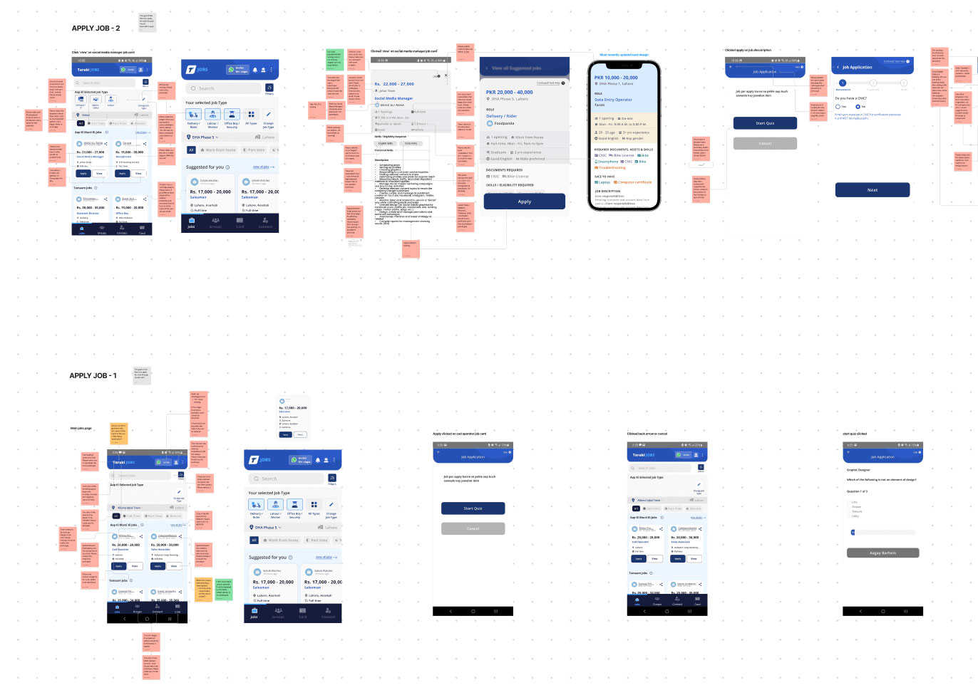
Usability Testing & Key Findings
To ensure the redesigned experience met user expectations, Designist conducted usability testing with job seekers and employers, analyzing their interactions with the platform. These tests provided valuable insights into user behavior, mental models, and feature expectations.
Through usability testing, we identified:
- User biases in information flow – For example, when selecting a location during sign-up, users assumed it referred to their preferred job location rather than their current location, causing confusion.
- Knowledge transfer from other apps – Users intuitively understood how to upload an introductory audio in their job application because the interface resembled WhatsApp’s voice note feature.
- Feature expectations – Many users wanted real-time updates on their job application status, emphasizing the need for better employer-applicant communication.
- Usage differences based on educational background – Users with varying levels of education interacted with the app differently, influencing how we structured guidance and accessibility features.
The Impact
The strategic redesign led to measurable improvements in engagement and usability:
- 50% increase in user retention, as job seekers returned to the platform more frequently.
- 67% sign-up conversion rate, demonstrating improved usability and trust.
- Higher employer efficiency, reducing hiring bottlenecks and speeding up job placements.
With a refined brand identity, an optimized UX, and an intuitive interface, Taraki successfully strengthened its position as an employment platform, empowering job seekers and employers alike.