A detailed Heuristic Analysis of NayaPay’s onboarding experience.
By Team Designist
Introduction
ABOUT
This study highlights some of the main pain points that the users face while signing up with NayaPay. The insights are presented in the form of a point by point, heuristic analysis of NayaPay’s onboarding flow.
How it all began
One fine day, Team Designist decided to conduct a detailed research on the Online Account Opening processes of six banks and E-wallets. After gathering insights from usability tests, and heuristic analysis, we decided to convey these insights to the world. We hope that our research becomes an inspiration for Designers to engage in Research as a learning practice.
our LIMITATIONS
This research was conducted with limited users, is observational and analytical in nature, and is based on the data gathered from usability tests and heuristic analysis. It focuses only on the user experience of potential customers and does not take business limitations and restrictions into account. This is why some pain points, may not be the responsibility of the E-Wallet but a result of other factors that Banks and FinTechs may have to comply with, such as State Bank requirements, business restrictions etc.
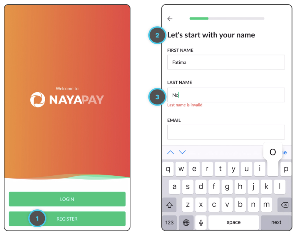
1. Getting Started with Sign Up
1) Button States
Button States are not clearly differentiated and defined. Both Login and Register buttons look the same.
2) UX Writing
Heading indicates that only user’s name is required, but there are other input fields to fill as well.
3) Errors
Even though, user’s last name is not yet entered, the input field shows an error. Plus, it is impossible for a name to be invalid except only for when special characters or numbers are used.
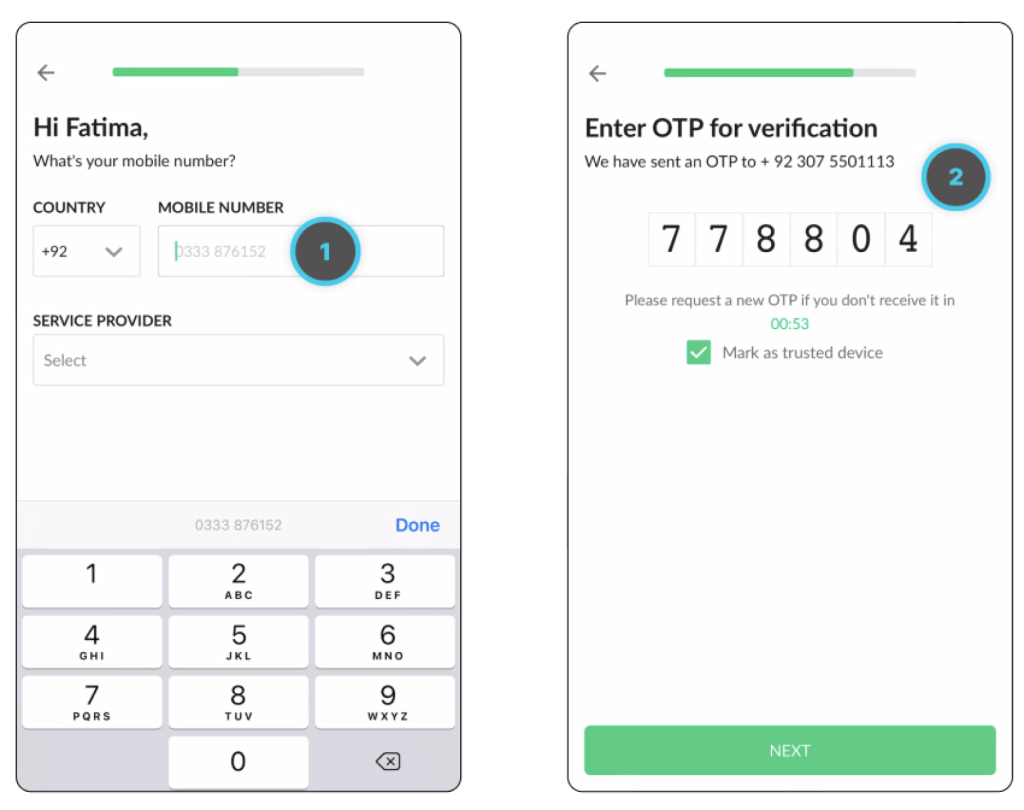
2. Mobile number and OTP
1) Help Text
Help Text indicates that phone number is to start with a 0 whereas the correct format for inputting a number alongside the country code is that it must not start with a 0.
2) Alignment
The OTP screen is not aligned properly. Headings are aligned to the left whereas the input field and the text below is centre aligned.
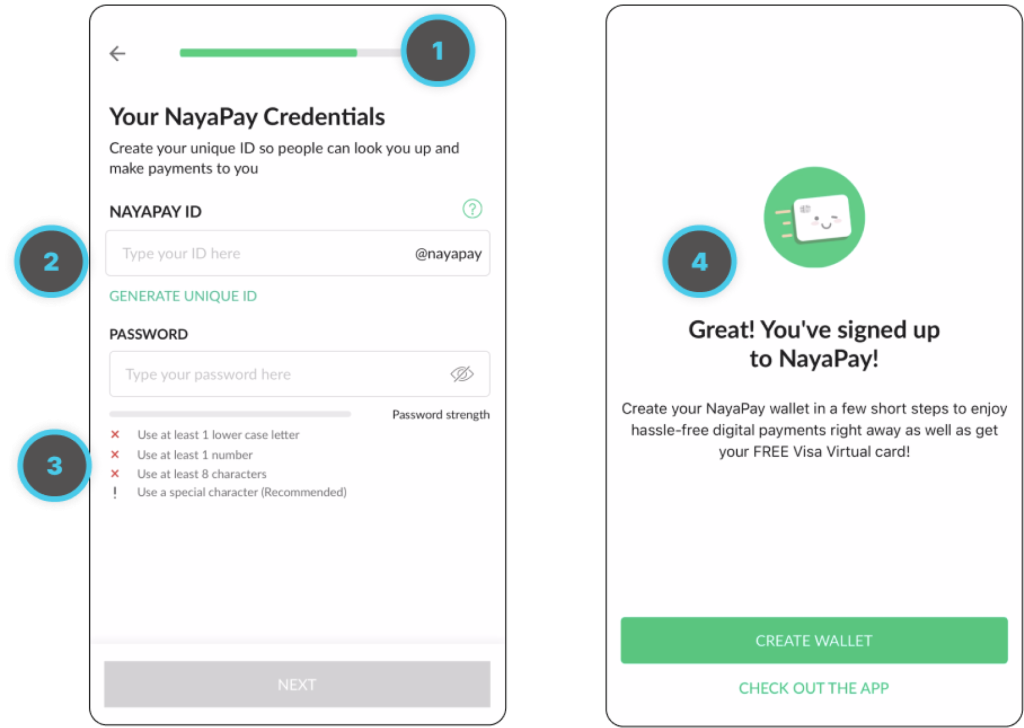
3. Finishing up signup
1) Visibility of Progress
The progress bar does not successfully indicate to the users where they stand in the process.
2) Help Text
Help Text says implies that the ID and password is created already and the user has to type it in.
3) Icons
The Icons used alongside password instructions look like tiny errors and are not representative of the text.
4) UX Writing
On the first screen, three different words are used to refer to the NayaPay ID. On the second screen, the text implies that NayaPay wallet is different than the app.
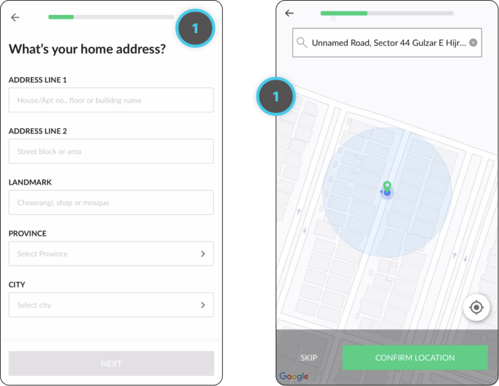
4. Address and Location
1) Lack of Information
After filling in the address, the app automatically tracks user’s location which is a cool feature. Though the purpose of fetching the location is not being communicated anywhere.
Plus, the progress bar restarts, again unable to communicate the status of the progress made.
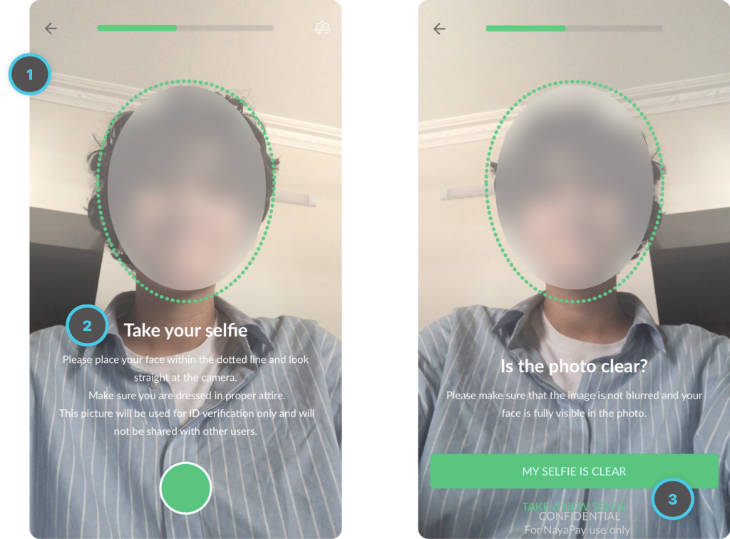
5. Capturing a Selfie
1) Lack of Information
Before the camera opens, the app does not inform the user that the user’s camera will be accessed by the app.
2) UX Writing
The guidelines are straightforward but the layout is not easily readable. The text is white in colour which can be difficult to read if the user is wearing white clothes.
3) Buttons
Buttons are not consistent, and are overlapping with the text, making them difficult to read and confusing.
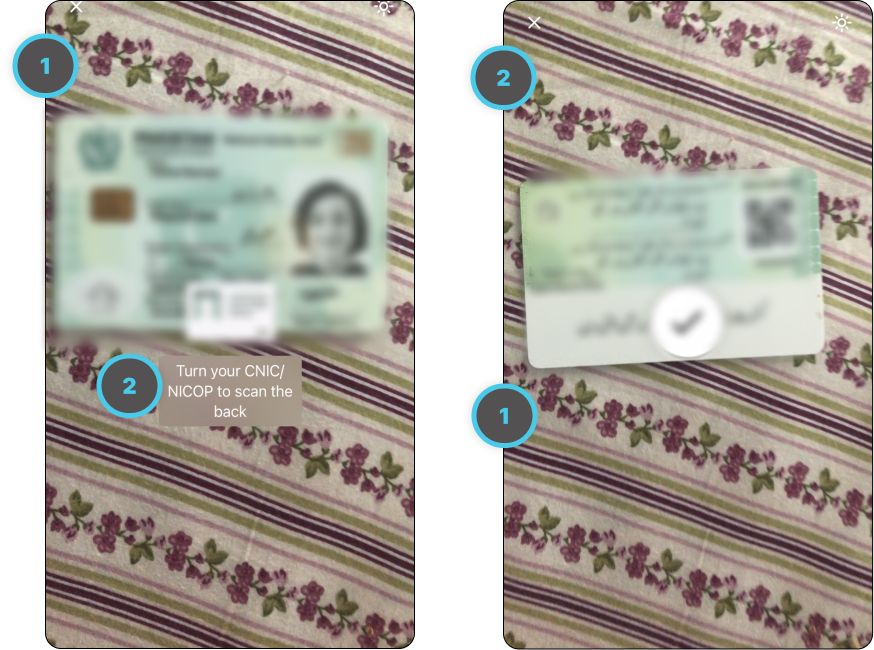
6. Scanning the CNIC
1) Lack of Information
No visual feedback or indication is provided when the CNIC photo is captured or is about to be captured which increases the chance of errors. When the photo is captured, the final photo is not shown to the user.
2) Help Text
No guidelines are provided to help the user position the CNIC correctly.
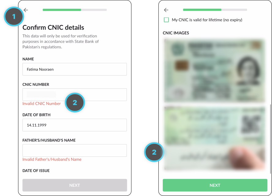
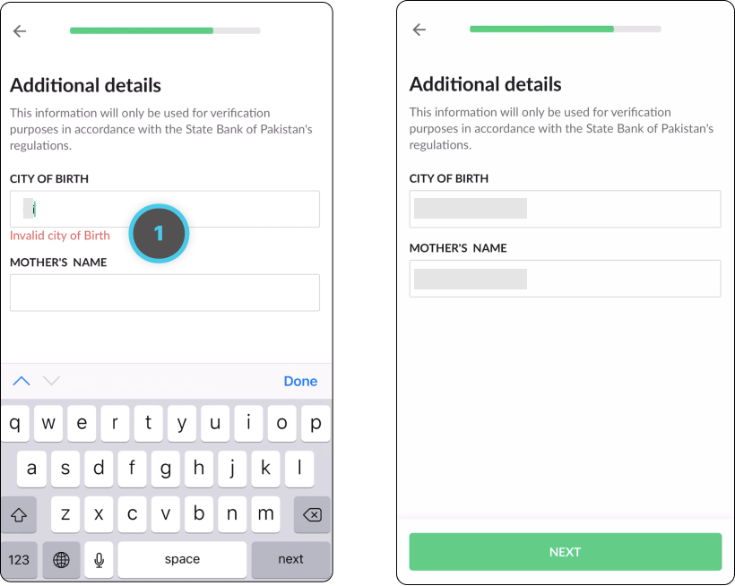
7. Confirming CNIC details
1) Lack of Information
Due to the insufficient information provided by the progress bar, the user is unable to know the amount of steps left, even towards the end of the process.
2) Errors
CNIC information gets autofilled but not correctly. There is no text in one input field but the error still says that the text is invalid. On the second screen, the error in the CNIC photo is obvious but still no error is shown. There is also no way for the user to recapture their CNIC photo.
8. Finishing up
1) Errors
Error is being shown even when the text is being input.
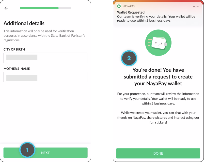
9. Request sent for Nayapay Wallet
1) Button Language
This is the last step after which the signup application will be submitted, but the button does not give a direct call to action to the user. Instead it says “Next”, indicating there are more steps left in the process.
2) UX Writing
The final screen, does not show important text in a hierarchal manner. The text shown is wordy and takes a lot of time to read.
I'm subtitle
Final Thoughts
With this heuristic analysis of Nayapay’s onboarding flow, we hope to bring attention towards the importance of Heuristics and why they should be kept in mind while designing any digital experience.
These heuristics provide a foundation for a good and seamless user experience. We believe that if Nayapay makes an improvement in the aspects highlighted above, the user experience of their potential customers will significantly improve.